MoPOP Star Trek Timeline
Cornish Year 3
Spring '16
Spring '16
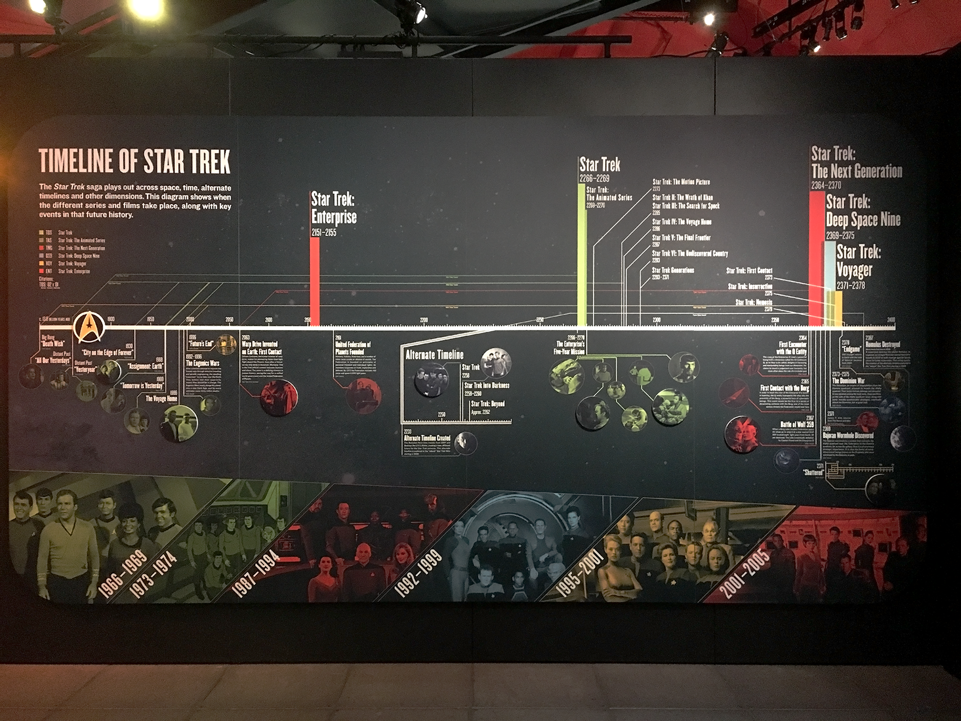
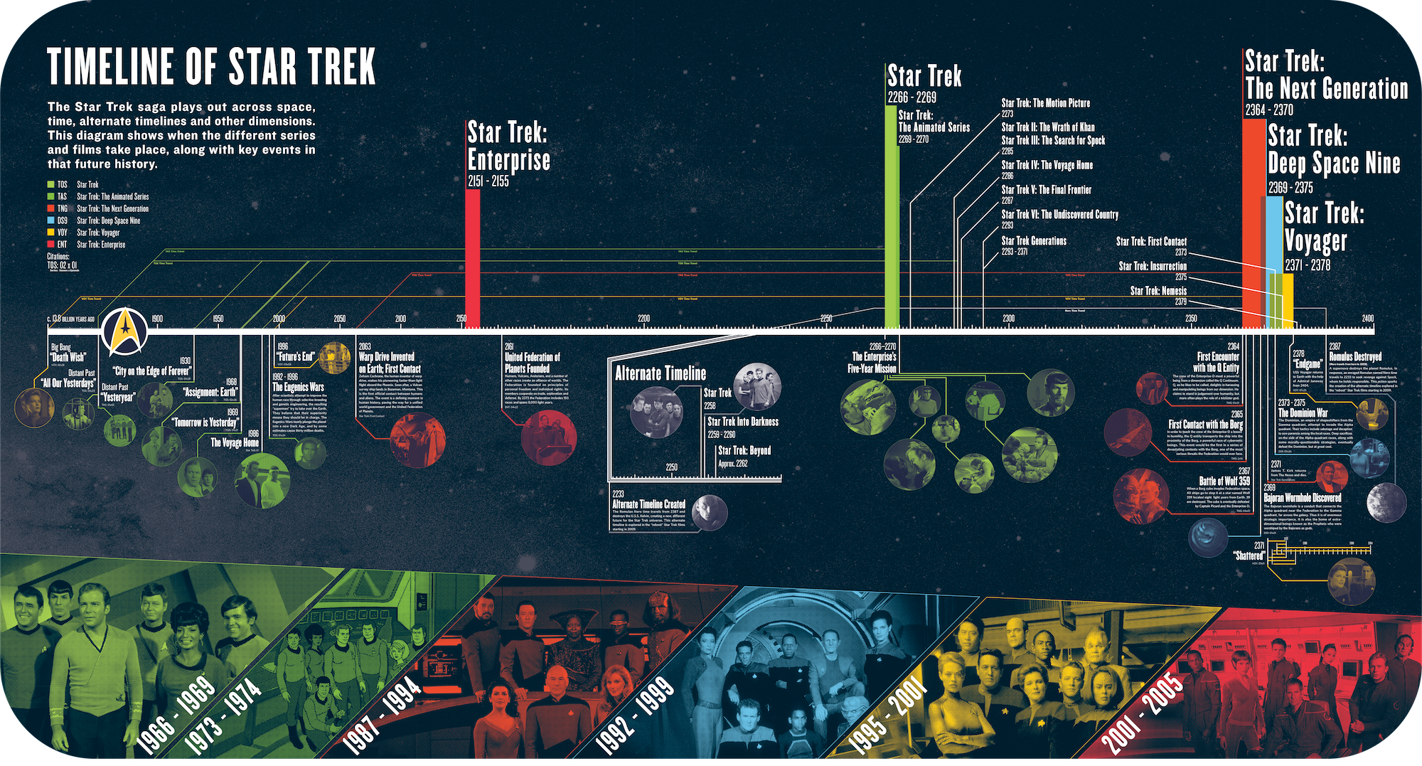
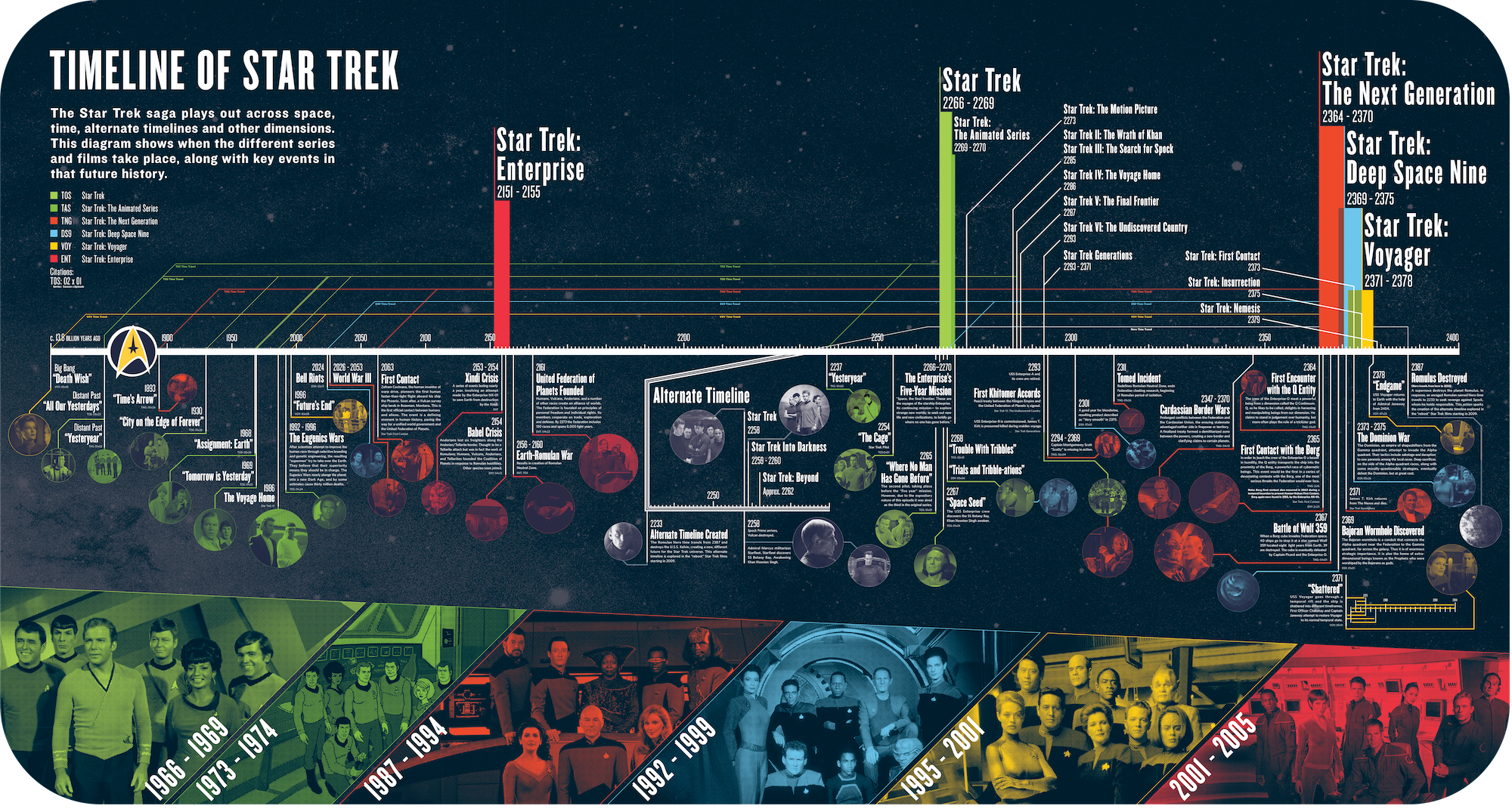
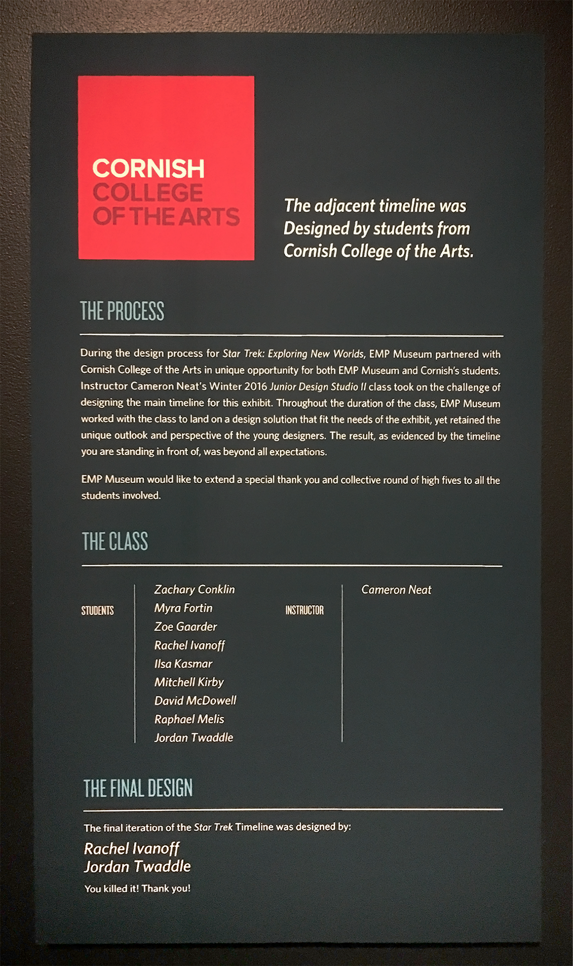
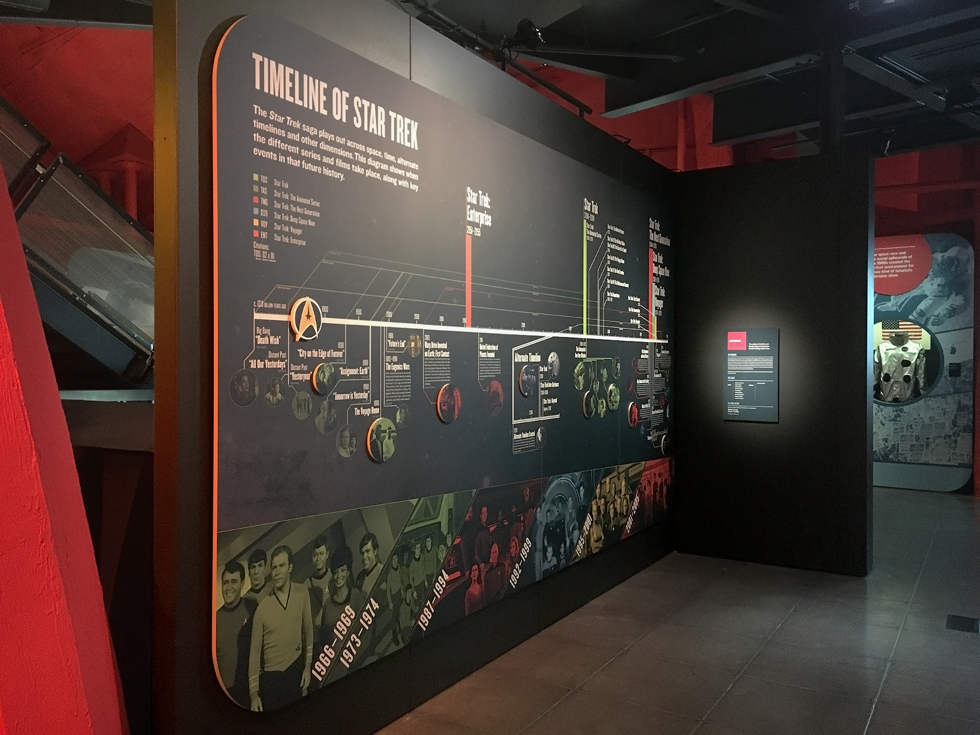
In this project we [Rachel Ivanoff and myself] designed an 8' x 15' timeline for the current exhibit Star Trek: Exploring New Worlds at the Museum of Pop Culture [MoPOP], formerly the EMP. The timeline details the fictional history of the Star Trek universe and features key events, their placement in the history of the series and movies, alternate timelines and the time travel of characters such as Kirk and Janeway. While developing our concept and design, Matt Cole, Exhibit Graphic Designer at the MoPOP, gave guidance and direction on the project. The project culminated in a final presentation of our design to a panel of representatives from the MoPOP. Our design was chosen to be manufactured and is displayed in the Star Trek exhibit.
Rachel and I agreed to work together almost immediately. She is a veteran and I was as new as you could be to Star Trek. We found that difference in experience, coupled with our other skills, we complimented each other too well not to take advantage of collaborating.
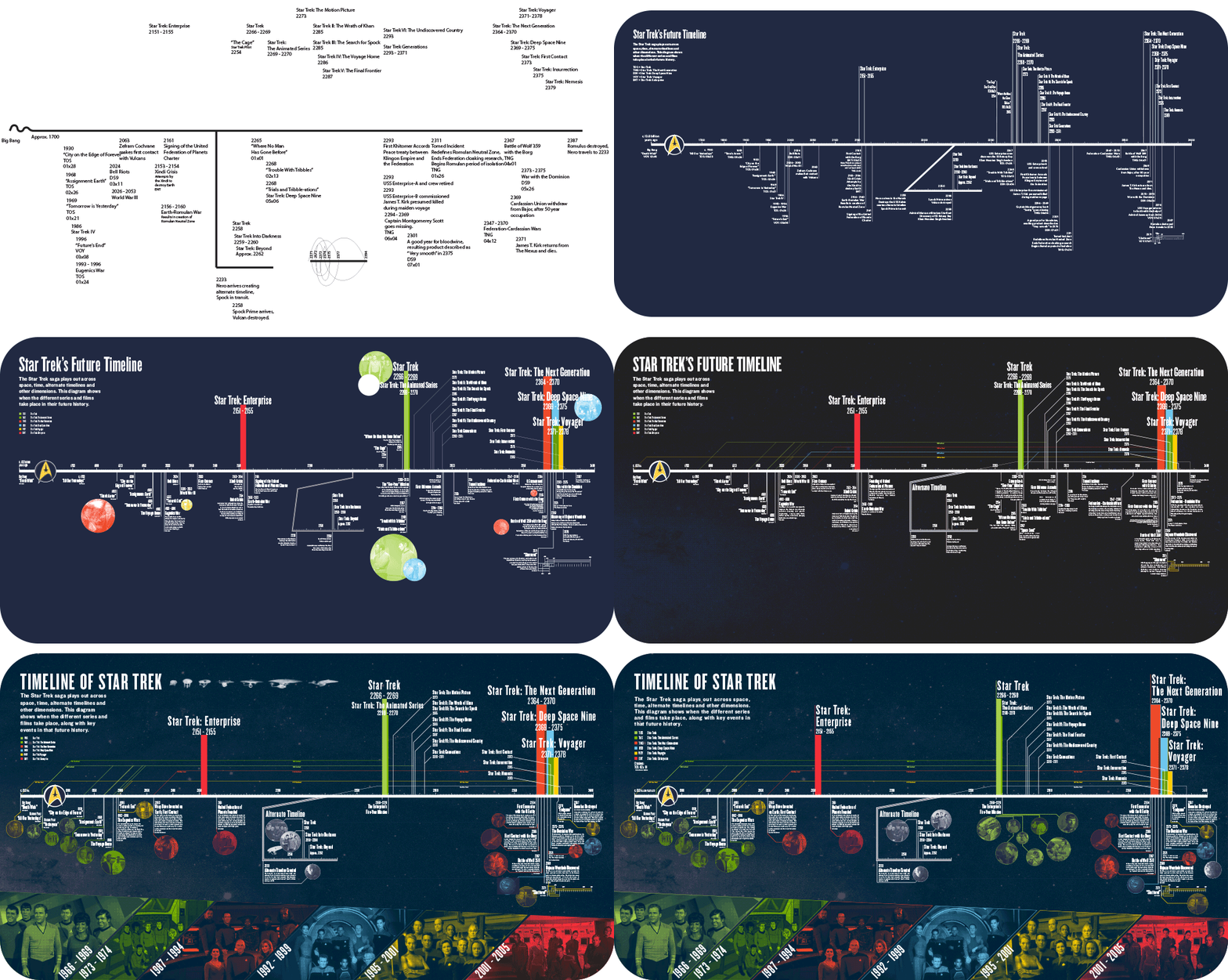
We toured the MoPOP and were introduced to key concepts of exhibit design. We then researched the Star Trek universe in search of interesting data points to suggest for the timeline. We set out on a straightforward design. Something technical but decipherable. The most important items being visible from a distance, the detailed items smaller and accessible for people to read and enjoy. We always kept the size of the project in mind as none of us had worked on something to this scale before. We drafted two timeline concepts to present to the panel of MoPOP designers. Printing them at 1 inch to a foot scale, full color. As well as plotting a full scale test strip in black and white.
We toured the MoPOP and were introduced to key concepts of exhibit design. We then researched the Star Trek universe in search of interesting data points to suggest for the timeline. We set out on a straightforward design. Something technical but decipherable. The most important items being visible from a distance, the detailed items smaller and accessible for people to read and enjoy. We always kept the size of the project in mind as none of us had worked on something to this scale before. We drafted two timeline concepts to present to the panel of MoPOP designers. Printing them at 1 inch to a foot scale, full color. As well as plotting a full scale test strip in black and white.
Tools: Illustrator, Photoshop
︎
